
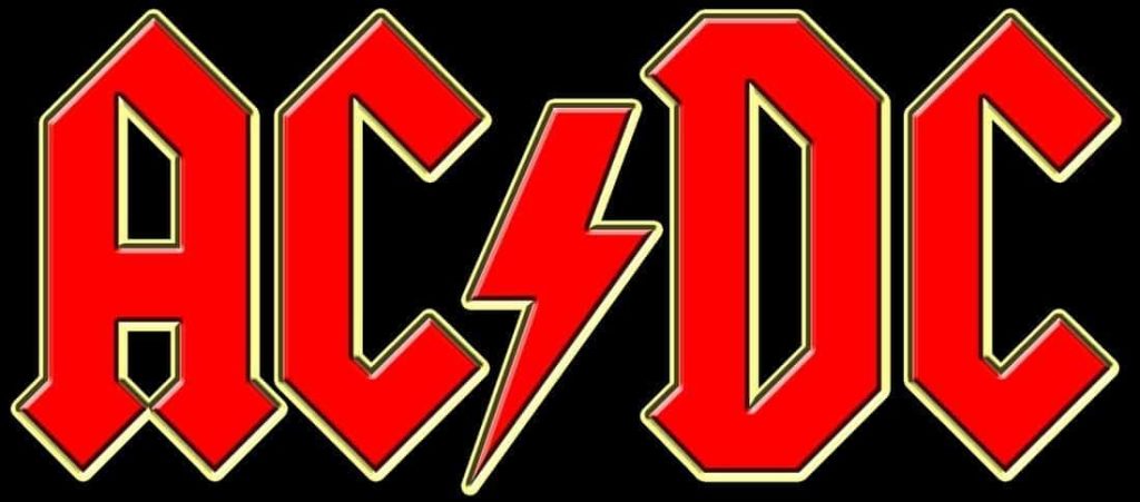
Few images in rock history are as instantly recognizable as the lightning bolt logo of AC/DC. For nearly five decades, the bold lettering split by a jagged bolt has become one of the most powerful visual symbols in music, appearing on albums, stage backdrops, merchandise, and countless fan tattoos.
But surprisingly, the man who created the legendary design says he never actually met the band.
The famous logo was crafted in 1977 by American typographer and graphic designer Gerard Huerta. At the time, Huerta was working in the music industry designing album artwork and typography for record labels, a role that often involved creating visual identities for emerging artists.
Despite producing one of the most enduring symbols in rock culture, Huerta’s connection to the Australian band remained purely professional and surprisingly distant.
A Design Born From Album Artwork
Huerta’s involvement with the band began when he was assigned to work on artwork connected to one of their early international releases. During that period, record labels frequently relied on in-house designers to craft visual elements for albums and promotional materials.
The designer developed a distinctive lettering style for the band’s name and added the now-famous lightning bolt between the letters “AC” and “DC.” The symbol perfectly echoed the meaning behind the band’s name, which refers to electrical current and was originally inspired by a label on a sewing machine noticed by the Young brothers’ sister.
Huerta drew inspiration from classic typography, including lettering styles reminiscent of historic printed texts, which gave the logo a dramatic, almost timeless appearance. The lightning bolt element emphasized the raw energy associated with the group’s music.
The finished design debuted prominently on the 1977 album Let There Be Rock, and it quickly became inseparable from the band’s identity.
No Direct Contact With the Band
Although the logo would eventually become one of the most recognizable images in rock history, Huerta has explained that his work happened without direct collaboration with the musicians themselves.
According to the designer, the members of AC/DC were still relatively new artists in the international market at the time, and decisions about album artwork were largely handled by the record company. As a result, the project was managed through label channels rather than through personal interaction with the band.
Because of this process, Huerta never met the group while creating the design, nor did he receive detailed creative input from them during the project.
It was essentially a case of a designer interpreting a band’s energy and identity from a distance — and getting it exactly right.
One of Rock’s Most Powerful Visual Symbols
What began as a piece of album artwork quickly evolved into a permanent visual trademark for the band. The lightning bolt logo has remained largely unchanged since the late 1970s and has appeared on nearly every AC/DC release and tour production since.
Few band logos have achieved such universal recognition. Alongside symbols from acts like The Rolling Stones or Metallica, the AC/DC logo stands as a defining image of rock culture.
Huerta himself has gone on to design logos and lettering for numerous artists, magazines, and companies throughout his career, but the AC/DC mark remains the work most closely associated with his name.
Even though he never met the band members who made it famous, his creation became an inseparable part of their legacy — proving that sometimes the most iconic elements of rock history are born behind the scenes.